I just finished a couple of FRx charting engagements and thought I’d share the technique I used.
A quick overview: the FRx report exports to Excel, then a chart in a separate workbook points to the FRx export for its data source. The chart reads the refreshed data when the period changes.
It’s critical that the chart lives in a separate file, because you’ll run the FRx report for different periods, and each time you export it, a fresh (chartless) version of the original file is created.) When you open the chart, you have the option to update its data, so it will read the new source data just exported from FRx. Anyway, enough theory—let’s move on to the screenshots and the how-to.
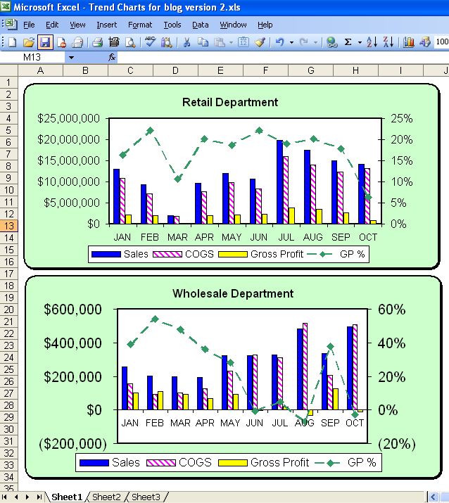
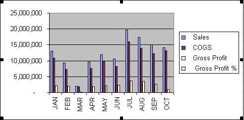
Here’s the finished product, with a couple of comments. This is a 10 month gross profit trend with a separate chart for each department. I would normally create a rolling 12 month trend, but for the sake of space, I just used 10 months. I also had to stick the legend at the bottom to make it fit here; I usually prefer it on the left side:
And an overview of the steps to create this chart:
Step 1 Create the FRx report
Step 2 Export to Excel in order to create the Source Data for the chart
Step 3 Create the Chart in a Separate File
Step 4 Chart Edits (to make it look better)
Step 5 Add a Secondary Axis for GP%
Step 6 Create the Remaining Departmental Charts
Step 7 Updating the Chart in Later Periods
So on to the details!
Step 1 Create the FRx report
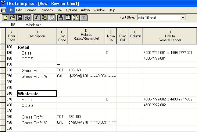
Use the full account segment in the row, segregating the departments:
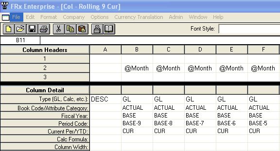
For the column, I’m using the Base period and the previous 9 months:
Step 2 Export to Excel to create the Source Data for the Chart
Tip: Mark the ‘Activate Workbook’ option to make Excel open with the results
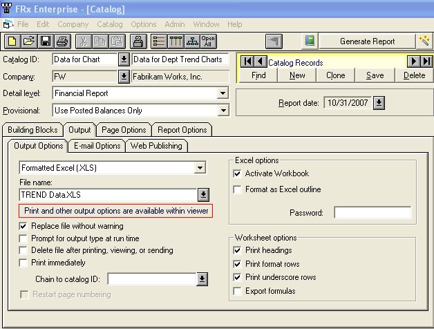
Before you generate though, here’s an important point: be sure to mark the catalog to ‘Display rows with no amounts’. The chart wants the rows in the data file to be in the same place every time, and this option will give you that.
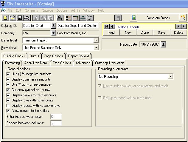
Generate the report in order to export the data to Excel.
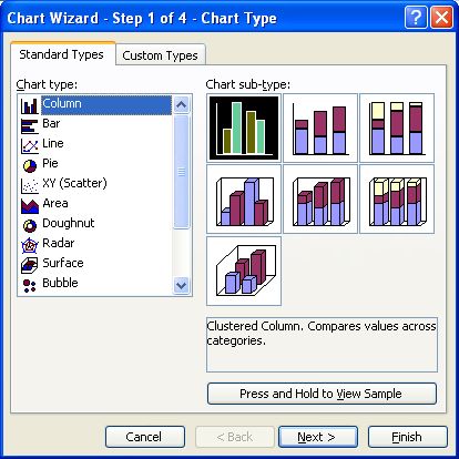
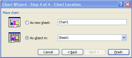
Step 3 Create the Chart in a Separate File
Now your FRx results are open in Excel. In the same workbook, use the File>New option to create a new workbook (although I prefer to use the ‘new’ icon since it’s faster). In this new workbook, Insert>Chart. For the above charts I used the Clustered Column option as shown below:
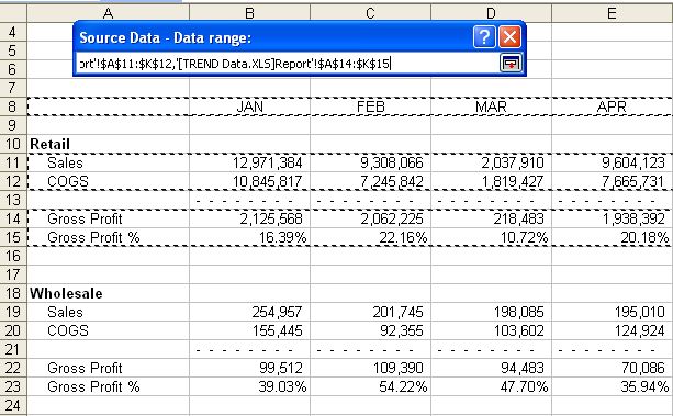
The next step allows you to select the source data from the other open workbook, the one with the FRx exported data:
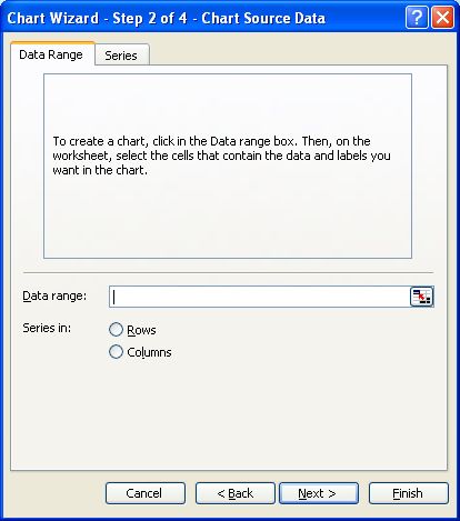
Click the multi-colored box to the right of ‘Data Source’ above, and move to the file with the data. Highlight the data for the first department only by holding down the Control key to select discontiguous areas. Highlight the column titles and the appropriate data, leaving out underscores. When finished click the multi-colored box (just under the ‘X’ below) to return to the Chart Wizard:
Continue, accepting defaults:
And your chart will end up looking something like this (note there’s no line for GP% yet):
Step 4 Edit the Chart
This step takes the plain chart above and makes it look a lot better.
I’ll leave you to your own devices to edit the chart to make it look better since there have been entire books written about this. But here are a few hints to help along the way: every element in the chart can be individually formatted. For instance, I’ve changed the default colors on each of the columns: doubleclick one of the columns and in the resulting Format Data Series dialog, choose your color and a Fill Effect if you want.
In addition, you can right click in several areas of the chart to get back to the Source Data dialog and also to the Chart Options dialog.
Here’s what else I did: I added a title, formatted the numbers on the axis, dragged to resize, formatted background and the plot area, ditched the gridlines, changed the border around the plot area, added drop shadow and rounded corners, enlarged the plot area, moved the legend to the bottom, and made the horizontal axis ‘January to October’ font smaller, just to name a few.
Step 5 Add a Secondary Axis for Gross Profit %
One more change is needed: notice that the dashed line for GP % is not showing up. In fact, there’s not even a column for it. Why is that? Because the data is too small in comparison to the dollar amounts to even show up at all. So here’s what I do to fix that (there’s bound to be a better way but I haven’t figured it out yet, and this is practical and fast): go back to your source data and in one of the percentages, enter a number that is comparable to the dollar amounts. (Write the percentage down as you’ll put it back later.) Now look at the chart: you should be able to see a new column for GP %. If not, repeat this process and enter a larger number until you can see a new column for GP %.
When you see the new column for GP %, doubleclick it: you get the Format Data Series dialog. On the Axis tab, choose Secondary axis:
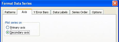
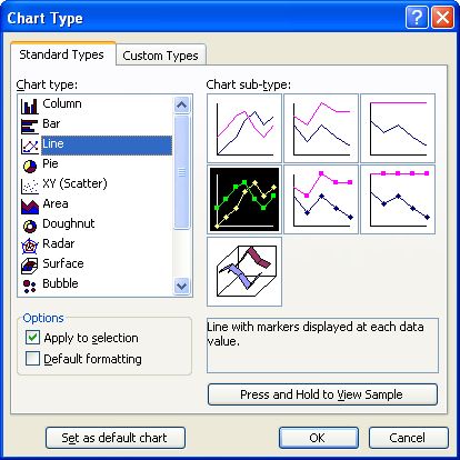
But you’re not through just yet. The GP% is still a Column, so now you need to turn the data series into a Line chart. How? You guessed it, doubleclick the column to choose the GP % data series. I chose the following option:
Your chart likely looks pretty wild right now. That’s because you purposefully have a wrong number in one of the percentages back in the data. Go back to the data, replace your high percentage with the correct one that you had recorded elsewhere, and now go back and look at your chart. Should be back to normal.
Now you can doubleclick the line and run through more formatting to make the line heavier, dashed, change the marker type, etc. I also formatted the percentages on the secondary axis.
Step 6 Create the Remaining Departmental Charts
Need to walk through all of the above for the remaining departments? No! Once you’ve got the initial chart formatted completely to your liking, click it, copy it, paste it. Voila, a brand new chart. Change the title. Right click and change the source data to point to your next department. Be sure to include the column titles. Repeat Step 6 for the remaining departments.
Step 7 Updating the Chart in Later Periods
What happens next period? Do you have to create the charts all over again? Absolutely not: that’s why it’s in a separate workbook from your source data. So next period, run (export) the FRx report to excel. Open the workbook with the charts and this is the message:
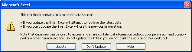
You do want the charts to read the updated data, so click ‘Update’ and you’re done.
Conclusion
There are so many things you can do with charts: P&L trends over different time periods, both current and year to date, balance sheet trends, ratios, operating expense comparisons, departmental or profit center comparisons to name just a few. It’s always a good idea to start with a handful based on your most pressing business needs. Then build on that.
I can highly recommend John Walkenbach’s Excel Charts for more on charting in Excel.
I’m using FRx 6.7 and Excel 2003 for this example. The charting options in Excel 2007 are more robust, but the theory behind using FRx and Excel stays the same.
Good luck and if you decide there’s not enough time in the day, that’s what I’m here for.
Hi Jan,
Thank you. This article was very helpful, it was very descriptive with screen shots and it helped finish my job easily.Thanks a ton.
Regards
Sneha S Kashyap
thanks for this article, saved my day for a presentation i have tomorrow!
How do you accomplish your 12-month rolling information across years?
No change needed for years…just Base-x in the period works whether current fiscal year or not. I once went out to Base-83 for a nonprofit client who needed 7 years for a grant proposal. Cheers! Jan
Hi Jan,
Thanks for the good info.
I’m sure you may have got this sorted in the 4 years since you wrote this post, but for the benefit of your other readers:
To avoid having to change one of the values in the data, you can instead click on the leftmost column in your graph (which will select that series), then use the up arrow on your keyboard to scroll through the other series. When you get to the series that is all at the bottom of the y-axis, you’re on your margin series.
Just right click in this general area and you’re in the edit series option. Probably saves you a grand total of about 5 seconds, but time is money I suppose…
I love any kind of time savings! Thanks for the tip.