Using FRx with Excel to create financial charts and graphs
While FRx doesn’t exactly have any inherent graphing capabilities, it can be used in conjunction with Excel to create a graph that automatically updates when the FRx report is refreshed. Here’s how.
1. First, choose or create the FRx report you want to graph.
2. Export it to excel, noting the filename and location.
3. If you choose ‘activate workbook’, Excel opens with your report.
4. Open a NEW worksheet and create your chart. (The Chart Wizard is a big help if you’re new to charting.)
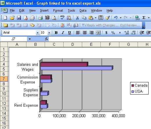
I’ve used a Clustered Bar chart with 3-D effects for this example. The data source will be the excel file just exported from FRx.
Now you’ve got a chart based on a separate excel data file. The data will change as the FRx report is run (and exported) for different periods, and the chart will update dynamically.
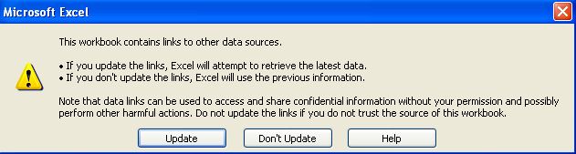
If prompted, choose to Update at this window:
Note that if you add titles to your chart by linking to the data file, you may have to F9 to update your titles to match the latest data file.
That’s it! The world of Excel charting awaits.
Leave a Reply